Ratios and exposure times

February 21, 2012

nonetodate asked: I have enjoyed the gum work and discussion.  

I do have a few questions regarding your process:

What amount of pigment do you put into the gum and how much gum is used?

Do you vary this ratio depending on the pigment color?

Do you use the same exposure time for each color pigment or do you vary it when you’re doing those multi layer prints?

Thanks.  Starting with the Magenta negative I mix equal parts (1:1) of Ammonium Dichromate sensitizer with Gum Arabic (12 dropper stems of each or 12:12) and about and inch of pigment (Schmincke Pthalo Blue for the cyan, Permanent Carmine for the magenta and Cadmium Yellow Middle for the Yellow).  I don’t change the ratio for the pigment but I do change it to achieve greater contrast (i.e. increasing the Gum to Sensitizer ratio to 13:11 and then 14:10).  I vary the exposure for the different “sets” of layers.  The first set of M, Y & C is a short exposure (no greater than step 3), the second set of M, Y & C is a long exposure (no greater than step 8), the final set is a short exposure again (no more than step 3) and the black is a really short exposure (about 30 seconds).  Actual times may vary depending on the exposure unit you’re using, pigments, negatives etc.  You can check out my post “Gum Bichromate Workflow 2012 ©” from January for photo illustrations of the process.

Black & White Gum Print Workflow © 2016

I had this idea to try making Black and White gum prints using a single negative but with multiple exposures.   Recently I experimented with using gray toned Rives BFK with a negative and a positive. I printed the negative using black pigment and the positive using white pigment—the gray would provide a neutral ground.  This idea was inspired by old master drawings where charcoal or ink was used on a “non white” surface (often tan) for shadows and white Conté (or similar material) for the highlights. The results were promising as evidenced by the test print below where Black and White pigments were printed with a negative and positive over Van Dyke that was printed with a negative.

image

I approached the new B&W workflow by eliminating the positive with white pigment and the gray Rives BFK.  Instead I use a single negative that I register on a piece of white Rives BFK with multiple exposures. 

Making the Print: Cyanotype

 I use Cyanotype as the first layer to add detail and enhance the D-max.  I do a 20-minute exposure (no greater than step 3 to avoid altering the color balance) before any gum layer is put on.

image

*I use Winsor Newton Lamp Black for sets 1-3

SET 1: 

I expose (about 1 min 40 sec) and develop enough to achieve slight tone in step 3.

image

SET 2:  I then increase the Gum to Sensitizer ratio to 13:11 (for greater contrast) and expose (about 6 min 30 sec) and develop to achieve slight tone in step 8.

image

SET 3:  I increase the Gum to Sensitizer ratio again to 14:10 and expose (about 1 min 15 sec) and develop the long enough to achieve slight tone in step 3.

image

Final layer (gouache) Using the same 14:10 ratio and the Cyan negative I do a short exposure (about 30 seconds) with Lamp Black.  Repeat if necessary for greater D-max and greater depth in the print.

image
image
image

Gray Scale vs RGB (Part 3: New Curve) © 2016

In my last post, I discussed how the old curve I used with Gray Scale negatives was too contrasty for RGB negatives when making my gum prints.  The old curve was based on creating eight distinct points (representing the 8 printable steps I can achieve with gum) and altering the input and output of percentages of black ink.  

In Gray scale mode, the Input levels and Output levels are represented in terms of ink percentages rather than light values in “Pigment/Ink %” (on left), where white represents 0% ink and black is 100% ink.  In RGB mode, by default, Photoshop displays the Input levels and Output levels gradients in the Curves dialog box from black to white in “Light (0-255)” (on right): black represents areas of no light, a brightness value of 0, and white, the maximum amount of light possible, at level 255.

image

To come up with a new curve, it was easier for me to work with the “Light (0-255)” graph.  I got the new input numbers for the new curve by using the old curve in RGB mode.  I just needed to find the new output numbers.

image

Fortunately, much of the preliminary work was done when I came up with the old curve so it wasn’t necessary for me to “start from scratch.”  Originally I used a densitometer to measure the percentages of black ink on a grid of 100 shades of gray printed on Pictorico Ultra Premium OHP Film and compare those readings with measurements from a Stouffer 21-Step Sensitivity guide. See post from July 4, 2011 for more information: 

I enlisted a former student of mine from Queens College and aspiring gum printer, Vanessa Fischer, to help come up with a new working curve. I made a printout of the 100 shades of gray for the purpose of writing notes.  

I identified those squares of percentages of black ink that corresponded to the old curve along with the correlating densitometry readings.  Using the eyedropper tool in Photoshop, I recorded the number that appeared in the “INFO” window in RGB and repeated for all 8 squares corresponding to the 8 steps in my curve.

image

In the example square below, the bottom number (0.87) represents the densitometry reading, the middle number (85) is the percentage of black ink from the old curve and the top number (54) is taken from the “INFO” window—which has now become the new output numbers. 

image

Below is a comparison of the old and new curve. The new curve is shown on the right in red below. 

image

Vanessa was able to try out the new curve before I had a chance to print.  Once I saw her result (below), I was convinced it was going to work.

image

The new curve.

image

Gray Scale vs RGB (Part 2: Full Color Gum prints) © 2016

While experimenting with making Gum Prints over Van Dyke this past fall, I realized that RGB negatives contain more information than same image as a Gray Scale negative (subject of my last posts).  I decided to explore this further and see how it would apply to my making full color gum prints.  

Below is the curve I’ve been using when making full color prints using gray scale negatives.  Complete workflow can be seen in my January 25, 2012 blog post http://tonygonzalezartist.tumblr.com/post/16491648522/gum-bichromate-workflow-2012

image

Below is a print made using the curve and gray scale negatives.

image

Next I made a new set of negatives using the same curve but with RGB mode negatives.  Below are the results.  Immediate observation revealed that although the curves translated identically on the graph, the prints however were different.  The RGB negatives produced a much more contrasty print which resulted in loss of highlight detail (as seen in the elimination of clouds and sky in the RGB print).

image

What was needed was a new curve for RGB negatives that would replace the old curve with the gray scale negative.  The graphs below shows the new curve (in red) compared to the old curve (in black).  

image

The following prints show the comparison of the old curve with gray scale negatives (right), the old curve with RGB negatives (middle) and the new curve with RGB negatives (left). 

image

The results of the new curve with the RGB negatives regained the highlight detail lost with the old curve using RGB negatives.  The color, tones, density and contrast are also well balanced.

image

Next blog post, the new curve…

Gum over Van Dyke

I was asked once if it’s possible to print Gum over Van Dyke.  I posted an answer saying I thought it was possible but someone tweeted this response to my answer:  “Gum over Van Dyke actually shouldn’t work because the dichromate is a silver bleaching agent.”  I knew this was not true but I had no proof –thus, I embarked on a test that resulted in the following print.  

Although printing Cyanotype over Van Dyke is not possible because the Potassium Ferricyanide in the Cyanotype formula is an oxidizing agent that removes silver and therefore would etch out the silver nitrate in the existing Van Dyke print underneath.  However, the Potassium Dichromate in the Gum formula does not bleach silver and can be used to print over Van Dyke prints.  In fact, it was typical for traditional Gum Printers to print gum over Platinum to add color (see Steichen print below).

For my print, I used a gray Rives BFK which I preshrunk, sized and hardened.  I printed the Van Dyke image using the Photographers’ Formulary Van Dyke Brown Printing Kit—although, it would be cheaper to purchase the bulk chemicals if you’re going to me making a lot of prints.  Afterwards, I coated the print with gum sensitizer at a 1:1 ratio and used Winsor Newton Lamp Black pigment with a short exposure (aprox. 1 min 30 sec) to add color and density to the shadows.  Then, using a positive rather than a negative, I coated the print with gum sensitizer at a 1:1 ratio and used Winsor Newton Permanent White gauche with a long exposure (aprox. 6 – 6 ½ min) to add color and tone to the highlights.

Although I’m pleased with the results of the experiment, the print itself can be improved.  The print was made using a RGB negative and positive but the curve I applied was the curve I used when I was using Gray Scale negatives. The RGB negative with the Gray Scale curve is too contrasty and looses detail in the highlights.  I’ve since revised the curve (a modified gray scale curve) for RGB negatives which will be the topic of my next blog post.

image
image

Edward Steichen (1879– 1973): “The Pond – Moonlight” (1904)

Color Management Issues (Part 2)

To make my CMY negatives for Gum printing, I go to Mode-Mulitichannel-Split Channels (I use the “C” negative to print with black pigment and a short exposure at the end rather than making a separate “K” negative). 

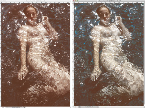
The image in the multichannel mode (left) is an approximate preview of what the final gum print (right) will look like.

image

I adjust the image before the Multichannel step by increasing the Cyan (30-45) and Saturation (around 30).  The increased Cyan and Saturation image (left) will look strange compared to the original image (right).

image

Without altering the image before the Multichannel mode produces a muddy red/brown multichannel image (left) as compared to the multichannel image with the increased Cyan and Saturation (right).

image

I find that altering the Cyan and Saturation (top left) renders a color balance in the Multichannel image (top right) that produces a gum print (bottom left) that matches more closely to the original image (bottom right). 

image

Color Management Issues (Part 1)

Although accurate color is achievable with Gum prints, there are two primary factors that determine the final outcome:  the workflow for making the negatives and the workflow for making the prints.  The two images pictured below show the original digital file from the camera (top) and the Gum print made from the same file (bottom).  I have found that how the photograph looks once you apply “Multichannel” to the image is how it will appear in the final print.  Therefore, I have developed a workflow (details to follow in my next post) that adjusts the image prior to “Multichannel” and before creating the negative.

image
image

SINGLE NEGATIVE WORKFLOW 2012 ©

1.  Open document

image

2.  Image-Adjustment-Invert 

image
image

3.  Image-Adjustment-Levels

image

4.  Auto

image

5.  Image-Adjustment-Curves

image

6. Apply CURVE

image
image

8.  Image-Image Size

image

9.  Width & Height smaller than media size-Resolution 300 Pixels

image

10.  Image-Canvas size

image

11.  Width & Height to equal media size-Canvas extension color-Black

image
image

12.  Drag step tablet onto negative creating a new layer.

image

13.  Position step tablet

image

14.  File-Save as

image
image

15.  Photoshop

16.  Layer-Flatten Image

image

17.  Save as-TIFF

image
image